Wow! A social ad that stands out in an overly saturated landscape!? Yep, it still happens. And when it happens, more often than not we’re talking about Facebook carousel ads.
There’s just something captivating in the swiping/clicking through the carousel cards. It’s also the best way to get the most information out of one ad (duh, more links and more creatives).
Carsousel ads are popular in eCommerce for a variety of products, events (eg. “check out this line up‘), and different features.
It’s also the best way to maximize their ad real estate and provide the most information.
So, what about you? Are you using carousel ads? How can you maximize your ROI with carousel ads? Let’s find out.
What are Facebook Carousel Ads?
You’ve probably seen Facebook carousel ads plenty of times on your news feed.
These particular ad types are incredibly engaging if done right. Brands use it to highlight a particular product or feature, create a how-to manual, or tell a story.
Thanks to the “carousel”, Facebook marketers got the opportunity to expand on their creativity and expertise. At the same time, the appeal of these ads makes it easier to convert your potential customers and boost your ROAS.
Therefore, there isn’t any valid reason for you to neglect carousel ads. Instead, roll up your sleeves and dive right into the ad creation process.
Carousel Facebook Ad Specs and Dimensions
Before you proceed, here’s a brief description of carousel ads specifications to keep in mind.
· Facebook carousel image size should be up to 1080x1080px with 1:1 aspect ratio (square)
· Every segment of the ad copy should fit into an optimal character threshold (headline: ≈ 40, body: ≈ 125, description: ≈20)
· Up to 10 carousel cards.
· Image size: up to 30MB
· Video size: up to 40GB
· Video length: No longer than 240 minutes
· You can use different links per card
It’s important to understand that each carousel card can be a video instead of an image and each card can link to somewhere else on your webpage. This creates an even greater platform to make your ideas a reality.
For instance, one card can be a short introduction video while the other 3-4 could showcase particular images/features. The opportunities and combinations are endless!
How Effective Are Facebook Carousel Ads?
Ever since its launch in 2014, Facebook carousel ads have performed pretty well. Mostly because they contain the “holy trinity” of any successful ad:
· They are engaging.
· They are visual.
· They are interactive.
The ability to tell a story or showcase several products will captivate an audience much more than a static, single card ad.
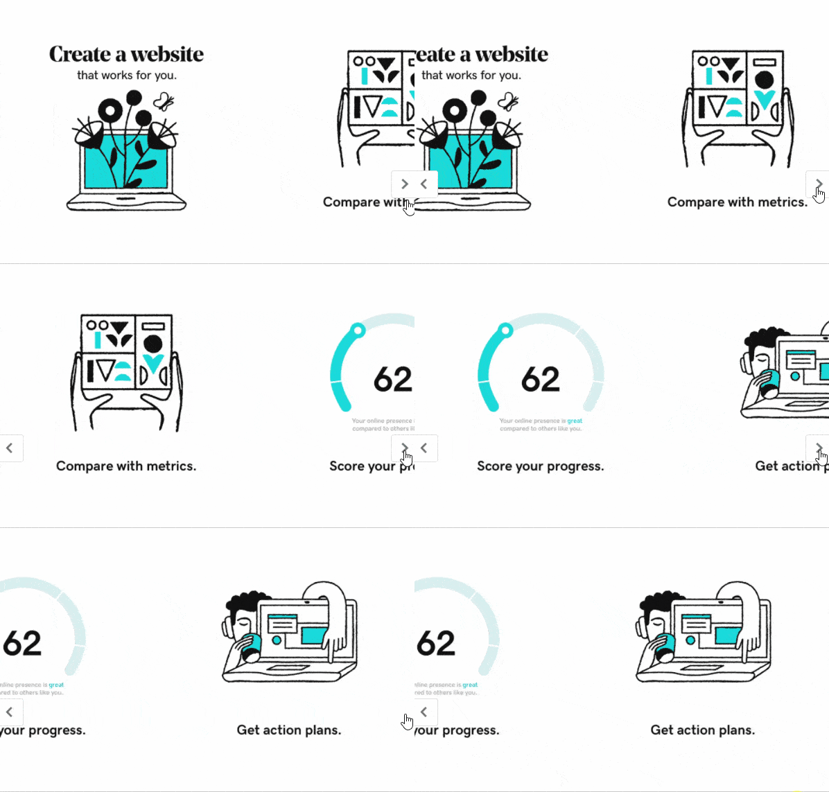
More importantly, you can up your game and create some scintillating stuff with the right sequence. Take a look GoDaddy’s ad below:
Hard not to engage with something like this.
So you can see carousel ads are particularly eye-catching. They leave an instant and quick first impression. And every marketer understands the importance of the first impression of an ad.
The little click or swipe you make to keep gliding through the slides makes you involved in the ad. It communicates and “invites” you to travel to a website or a store, to learn more.
Over time, brands got more creative and you could come across carousel ads that were a real work of art (more below).
Why You Should Use Facebook Carousel Ads?
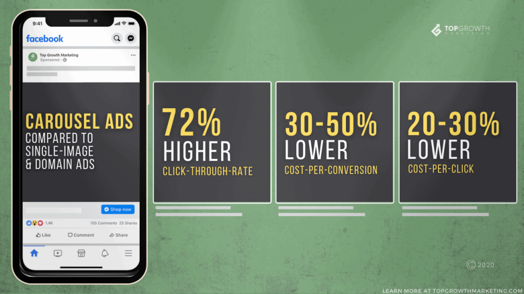
According to post-launch reports, Facebook carousel ads immediately performed ten times better than single-image ads. This includes a wide range of different products, industries, and services.
Online stores can utilize carousel ads the most obvious way – show as many products as possible for example. However, there are no limits to what you can do if you’re inventive enough.
Here’s why everyone could (and should) create and test at least one Facebook carousel ad.
Potential Customers Revel in Choice
Prospects don’t like when you wave a product in front of their nose and go – Buy this! This one product will solve all your troubles!
Anyone that understands the customer’s journey will tell you the same thing – Your potential customers love having a choice.
And with a good Facebook carousel ad, they can enjoy it to their fullest.
On top of that, you can showcase a bunch of products from your store using the same ad. Does that mean a higher chance of conversion? Exactly.
Facebook Business regularly posts case studies to back these claims.
JustFab, for instance, is a membership-based shopping platform that has run ads with a particular goal. They wanted to boost their membership at the lowest possible cost per acquisition.
For that reason, they’ve run a campaign with carousel ads displaying several products.
A wide choice of attractive luxury items at one place (in one ad) propelled the audience to sign up for their membership and indulge in all of the benefits.
In just two weeks they’ve managed to double the number of their VIP members while reducing CPA by more than 25%.
Moral of the story: don’t underestimate the power of choice.
It Could Replace “Retail” Effect Now & In the Future
The majority of shoppers crave that “in-store” feeling when shopping. Especially during the holiday season. It takes “window shopping” to a whole different level.
But with how 2020 is going, it looks like plenty of passionate shopaholics will shop from the comfort of their homes.
Moreover, a chunk of retail heavyweights like Target already announced that they’re closing their doors for Thanksgiving to ease the spread of the pandemic.
However, carousel ads can step in to fill that retail-shaped hole. Instead of browsing the shelves, you can swipe the carousel cards until you find that one thing you desire.
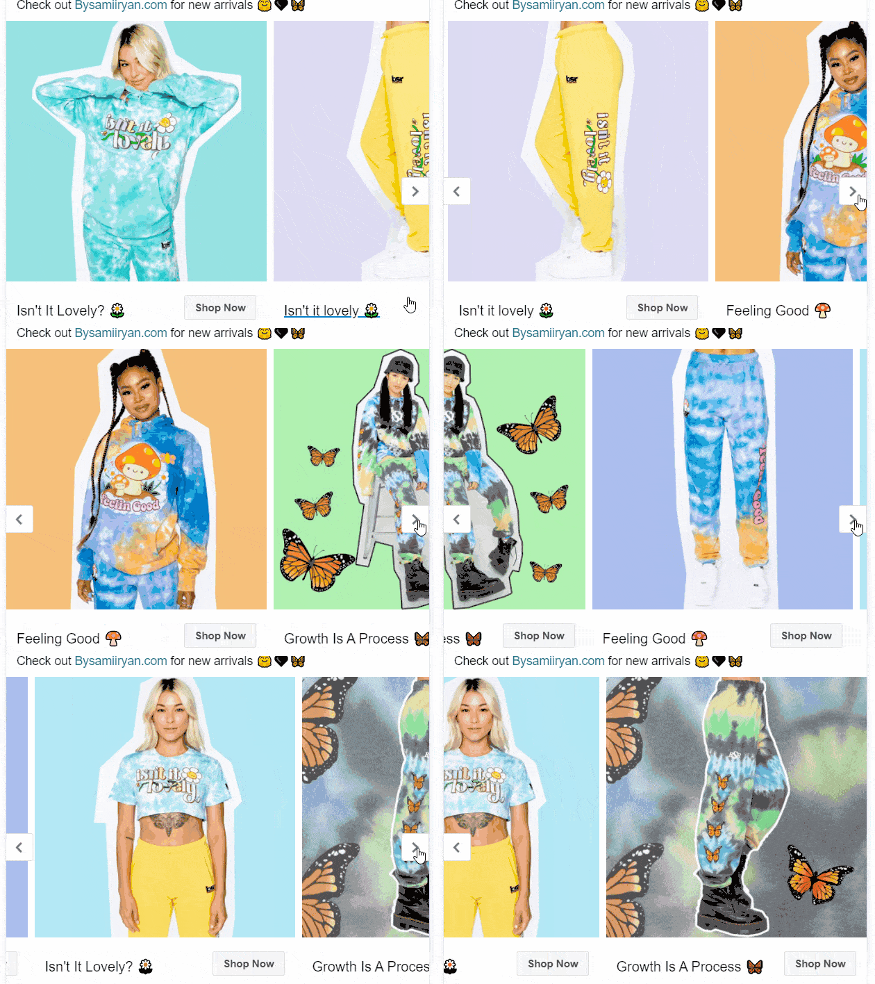
At the same time, it’s a great way for a brand to showcase the diversity of their products. Like this carousel ad from By Samii Ryan for example:
Mix and match, full sets, a great way to introduce a new collection!
It’s a Great Visual to Tell a Story
People love stories. Usually, the highest converting ads are those that amuse us or let us relate on a personal level.
So why not let a carousel ad do the trick?
Whether it’s a display of product features, a captivating brand story, or a “how-to-use” manual, you can present it with carousel cards.
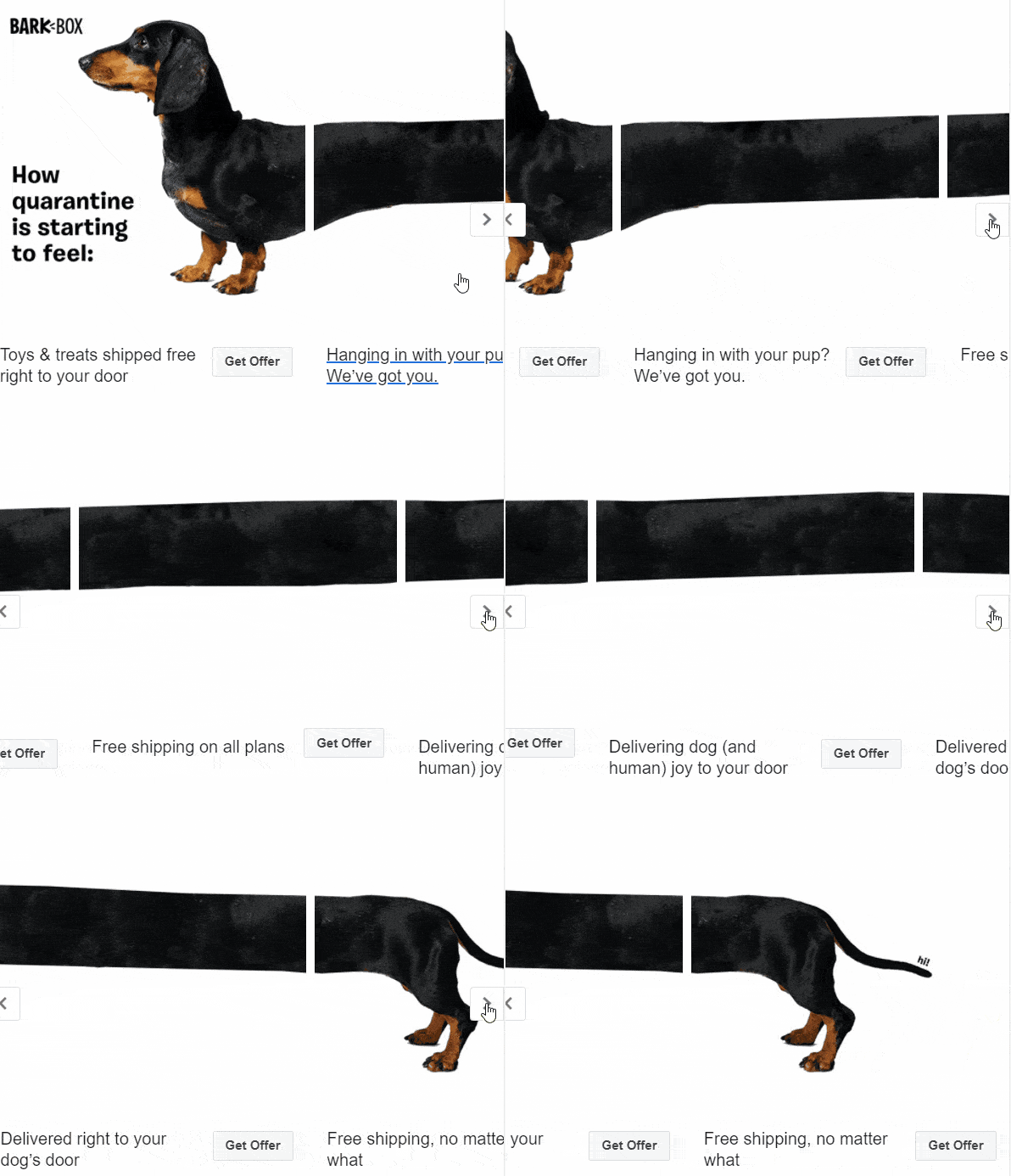
In fact, if you’re creative enough you can do anything you want. Check this out:
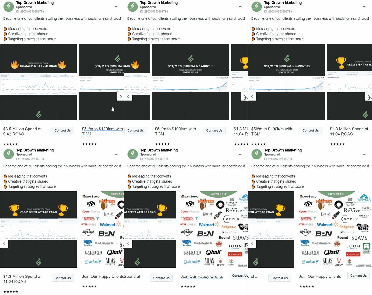
Service providers can also benefit from a well-thought-out Facebook ad. To tell you the truth, we are also utilizing the power of carousel ads to introduce our agency to potential clients.
Also, when you want to explain an added feature to your existing users, not many ways are more efficient than a carousel ad. Here’s how MailChimp introduced their creative assistant feature:
Don’t forget – you can also insert a video into your carousel ads and enrich your story even more!
They’re Scroll Stopping
Just look at the ads above. They all have a vital trait when it comes to Facebook ads. They make prospects pay attention. They make you want to learn more.
The biggest challenge of every Facebook marketer is to create a scroll-stopping ad. If potential customers are just scrolling past your ads, you’re doing something wrong and it’s costing you.
But with a little bit of effort and inspiration, you can make a real delicacy out of your carousel. Facebook is teeming with various ads – you got to make yours count. It has to stand out.
Bonus: If you’d like to learn more about how to make captivating ad creatives this article may ignite a creative spark!
Want amazing carousel ads for your brand?
How to Create a Facebook Carousel Ad?
If you’ve worked on Facebook before you should be familiar with the initial creation process in Facebook Ads Manager.
Things like choosing a campaign objective, targeting, and bidding are pretty much the same. After this, it all comes down to the ad set up.
Step-By-Step
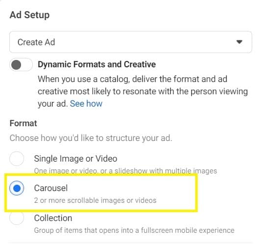
When you set up an individual ad, under “format”, you’ll need to choose the “Carousel” Facebook ad type in the “Ad Setup” section.
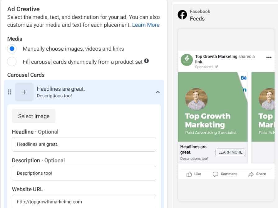
And below in the “Ad Creative” section is where the real action happens.
If you want to maximize the potential of your carousel ad story, you should choose the “Manually choose images, videos, and links” option.
Otherwise, the algorithm will automatically pull the information from a website. So it looks like a carousel, but it’s actually a DPA (dynamic product ad). These look like catalog photos so we strongly recommend using the manual option.
Now for the fun part. Take some time to design each carousel card. Make sure they make sense, they tell a story, they have a nice flow. It’s important to note that every card has the same ad structure as an individual Facebook ad.
Only make sure to follow the Facebook ad format when you’re choosing the image. Namely, the Facebook carousel image size is not the same as Facebook post dimensions.
The top card will always appear first in the carousel sequence. Essentially, it’s the hook. If you’re following a strict story flow, make sure you follow the card order (and untick “top performing card”).
Luckily, the little preview to the right will make your life easier. You can interact with it to see how it would look like on mobile and desktop!
Eye-catching carousel ads can streamline that journey to high ROAS and/or conversion rates.
Once you’re finished with the setup, just publish the ad and get ready to track it. Remember – don’t set and forget! Your ad won’t perform to the best of its ability. It takes a lot of testing and time until you get to optimal results.
High-Converting Facebook Carousel Ad Examples
Okay let’s get closer to the finish line. Over the years we’ve worked with some top-notch clients and made thousands of ads (great ones, if we do say so ourselves).
Out of those, quite a few fell into the carousel bracket. Now it’s time to share some with you.
As you probably know, carousel ads are perfect for clothing and fashion stores. Whether it’s the release of a new drop, end-of-season sale, or a special collection, carousel ads can do an excellent job.
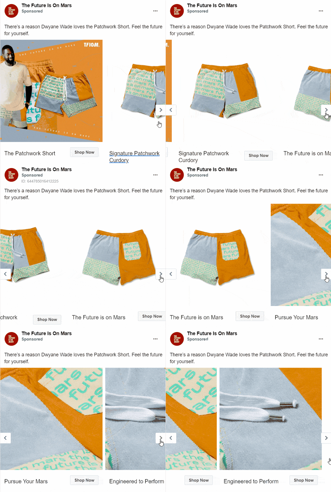
For example, this ad by The Future Is on Mars accomplishes two things. They boost social validation by starting their carousel sequence with NBA star Dwayne Wade. They showcase their product afterward.
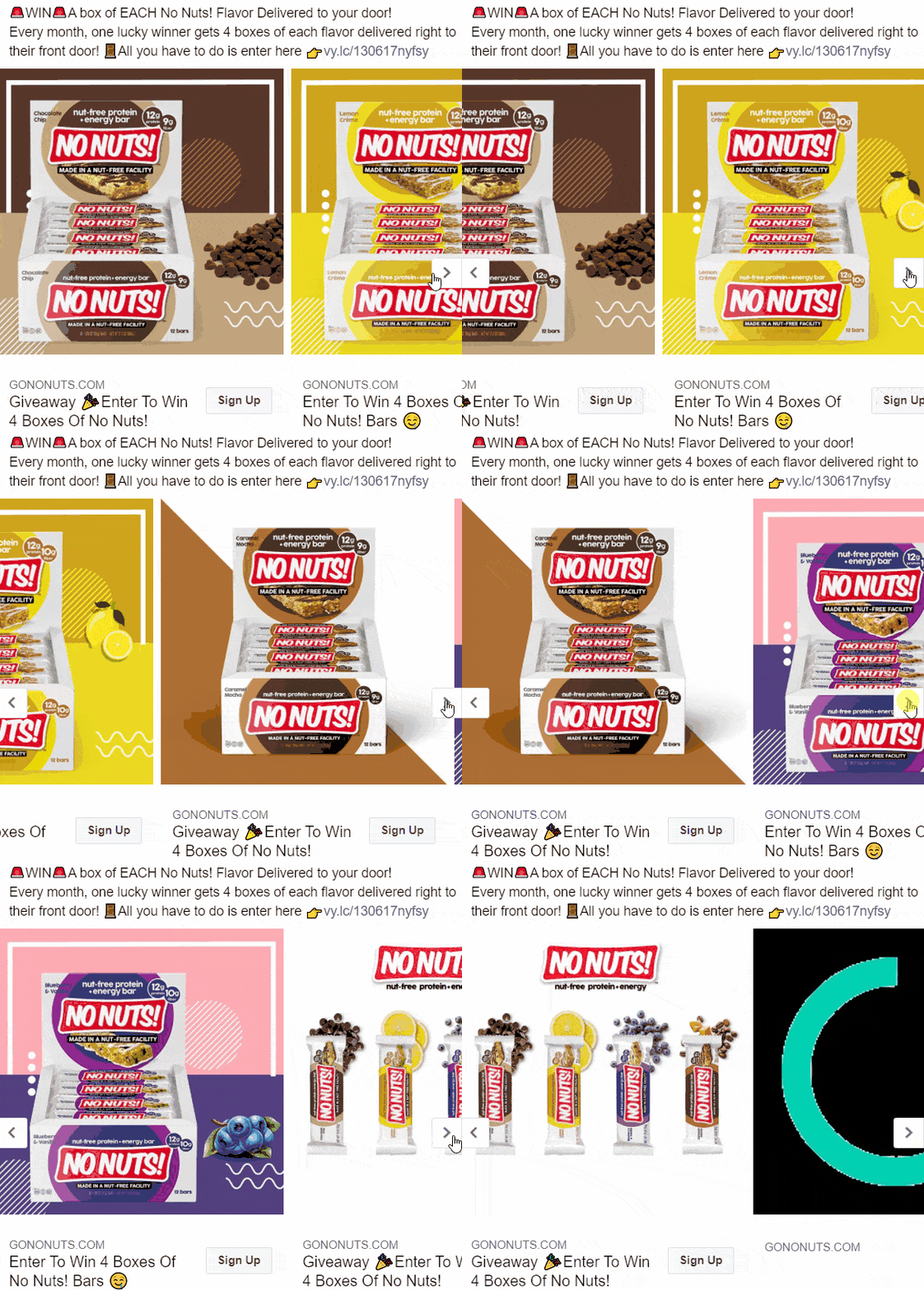
On the other hand, the No Nuts ad below utilizes the power of carousel ads to introduce potential shoppers to their Vyper giveaway contest and the chance to win one of each flavor.
The carousel ads show the variety of flavors (you could also advertise the bars on WHY you would eat it – Great for hikes, High in protein, No nuts!).
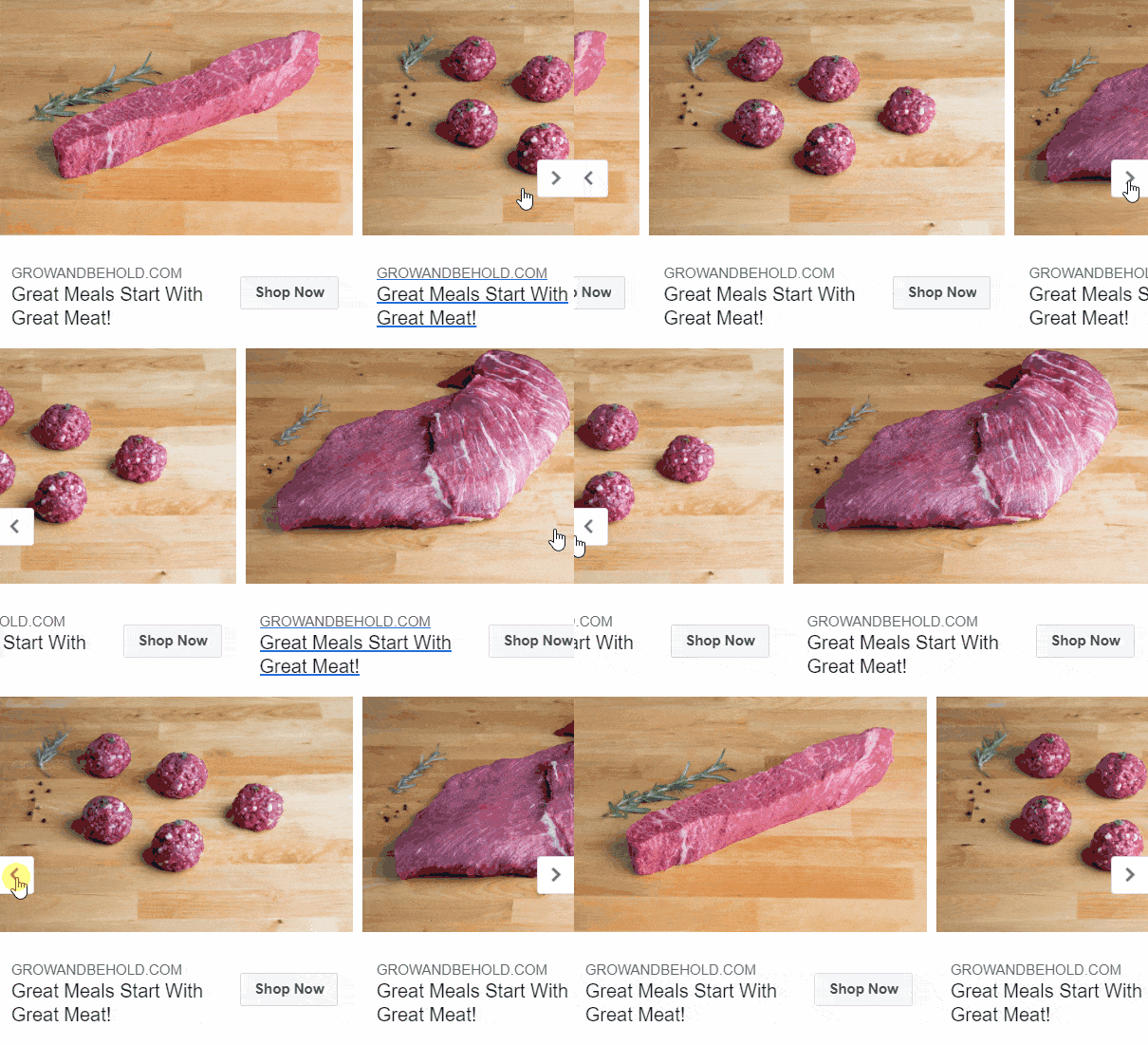
This Grow and Behold ad displays their mouth-watering premium kosher meat. So many cuts to choose from, why not display more?
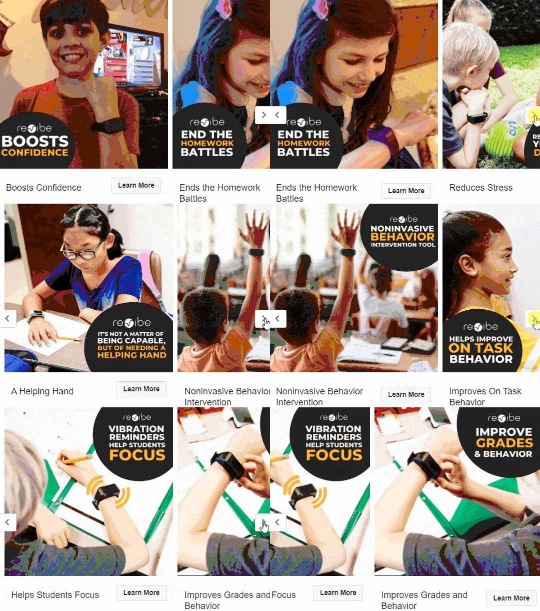
This ad by ReVibe Technologies outlines all the features and benefits of their unique product:
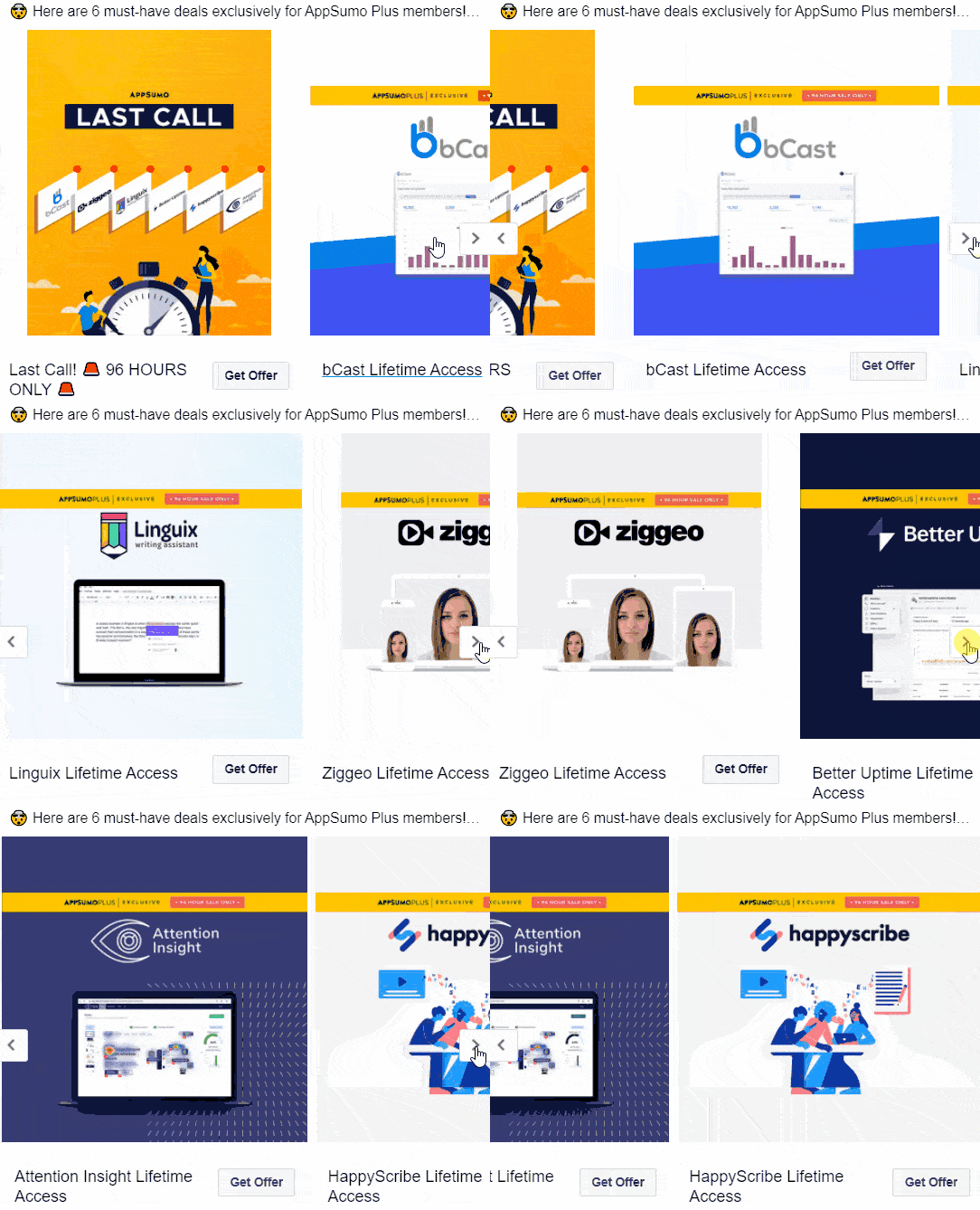
And here’s how AppSumo promoted their once-in-a-lifetime offers for their Premium members:
That’s about enough for now! We don’t want to reveal all the cards, right?
As you see, these ads are simple enough to make but bring plenty of value to the table. Utilize them well, and you’ll see some amazing results.
All Aboard the Merry-Go-Round
The best part of the carousel ad is that it allows users to decide whether they want to immerse themselves in an ad. If they want, they just keep swiping the cards. But most importantly, it gives them choice.
For that reason, they are less “invasive” and more appealing to your everyday user.
Also, that’s the best possible way for agencies, service providers, digital product sellers, blog promoters, and others to showcase their brand and tell their story.
It can also produce some mesmerizing masterpieces. So if you think you’ve got it, what are you waiting for?
Did you have success with Facebook carousel ads? Do you have any examples to share? Share your opinion in the comments section below.
Also, if you want more similar articles, tips, and case studies, feel free to contact us or subscribe below so you never miss a post.








0 Comments