
TL;DR
The best Facebook ads pair a clear single offer with visuals that stop the scroll in under 3 seconds—brands that follow proven creative do's and don'ts consistently see 2–4× better click-through rates. Avoid common mistakes like too much text, vague CTAs, and mismatch between ad and landing page to get the most from your ad spend.
What makes a great Facebook ad?
Great Facebook ads stop the scroll in the first 1-2 seconds, deliver one clear benefit with proof, and end with a single call to action. Vertical short-form video with UGC consistently outperforms studio creative by 30-60% on CPA in DTC.
What should you avoid in Facebook ads?
Avoid stock imagery, multi-message creative, dense text overlays, and ads that fail to identify a single audience pain point. Generic 'we sell X, buy now' creative routinely runs 2-3x higher CPA than benefit-led UGC.
How long should a Facebook ad video be?
For DTC, 15-30 seconds usually performs best on prospecting, with 60-90 seconds for higher-AOV or considered purchases. The hook must land in the first 1-2 seconds regardless of length.
Facebook ads can be a tough nut to crack but once you do, the world is yours for the taking!
Below is an easy to read guide on what you should and should not be doing when it comes to creating your Facebook ads.
Some Basic Tips To Remember When Creating Facebook Ads
Copy:
- No more than 1-2 sentences per paragraph
- Include link before the “view more” first 2 sentences.
- Use emojis
- Include a CTA (tell them what you want them to do) Share, Like, Comment
Image:
- Click image ad size (1200x628)
- Use lifestyle + Product (make product the focal point)
- Test 2-3 images per persona angle
- Use brigher colors and images
- Need to stop someone from scrolling (shock, fear or awwww factor)
- Keep text under 20% of the image
- Use square images for slideshows
Carousel / Slideshows:
- Up to 8 images
- Have similar styling on images
- Use each frame to explain a step
- Have a progression of a story
Video:
- Use subtitles
- Start holding image needs to be scroll stopping
- Variations (15sec, 30sec, 60sec) try and make 30 sec the most common
- Get your story, message, and CTA across in that 30 sec
Examples Facebook Ads Broken Down And Analyzed
Facebook ad 1
Doing It Right:
Text - Using [brackers] to draw you attention to the FREE video training they want you to sign up to. Great way to highlight the CTA.
Image - Using Eye contact to grabs people's attention. The use of yellow in the background stands out from the Facebook blue and the CTA draws your attention to click the image which then redirects to the ads final URL.
Needs Improving:
Text - Did not include a link in the ad text for an extra CTA option, used too many CAPS in the copy and also needed to split the second paragraph into two.
Image - The text in the image is well over the 20% rule so they could be paying a higher CPM in the bidding auction.
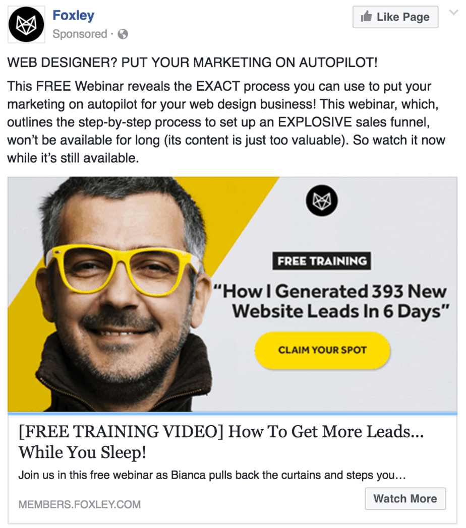
Facebook ad 2
Landing Page - https://help.leadquizzes.com/en/articles/how-to-collect-leads-using-leadquizzes-3
Doing It Right:
Text - Using statistics and numbers to lure you in to find out more. This is a great technique to tie in with case studies, educational content and in this case a webinar as well. People love numbers and lists.
Image - The color choice stands out and is a scroll stopper. Using interesting looking people is a great tactic for also grabbing people's attention (e.g. strange hair color, tattoos, doing a strange pose, body out of proportion, clothing attire, facial expression etc).
Needs Improving:
Text - The stats are out of context they should have included a brand that has done this or the industry that it was done in.
E.g. How VYPER generated 50,000 leads in 30 days or How Bob's Market generated over $100k/m in 30 days.
Image - The image is super strong but the copy in the image lets this ad down. The text is not very interesting and a bit of a sell out that the secret is their own product.
It should have been tied in with the text "My Secret to Generating 50k leads in 1 month?" then CTA - "Learn How".
Facebook ad 3

Landing Page - http://neilpatel.com/podcast/
Doing It Right:
Text - This sponsored post is a much more organic looking than most. The text is long and can be expanded as well as including more of a pain point/story instead of a direct response sales pitch.
Image - Neil is lucky enough to be able to use images of himself to get clicks as one of his strongest assets is his personal brand.The image used makes the post feel like it is from a friend not a company trying to take your money.
Again this image plays on the more organic looking feel as an image like this looks like a post from a friend, not a company trying to take your money.
Needs Improving:
Text - This looks to be a boosted link post as there is no CTA almost all of the text is getting cut off.
Get familiar with the character limits from Facebook and try and stick to them when writing/ editing link titles and text. Also the use of emojis could have broken this text up a little better.
Image - The image could have been more focused on him. Meaning a more neutral/solid color background, less blurred towards the bottom of the image.
OR just a little less zoomed it, a bit more context to where he was would have made this image more interesting.
Get Access To My Facebook Hacks Video Library. Click HERE!
Facebook ad 4
Doing It Right:
Text - This Facebook ad used emotional very well, nobody wants to suck at something and it immediately grabs your attention as the viewer takes offense and provokes emotion.
This ad is very specific messaging so the targeting on this ad would have to be very accurate.
Image - The use of the google logo immediately helps you understand what the ad is about. The cartoon is a little random but still has a good amount of color and interest.
Needs Improving:
Text - They could have added the link in the copy and also given a statistic how how much money is wasted from unoptimized accounts. The link description needs to be crafted instead of pulled in by the page metadata.
Image - The "how to" should have been a little bigger and still stayed within the 20% (meaning they would not get penalized).
The other issue with this image is the colors are similar to the Facebook blue. Your ads tend to blend in and get lost in the platform if you go with blue, would have been much stronger as a red, purple, orange etc.
Facebook ad 5
Landing Page - Did not save 🙁
Doing It Right:
Text - Using statistics to add credibility. They are also very confident and to the point about what they are offing and the use of the emoji is good.
Image - They draw your attention the title straight away with the red banner. They are also aligning the text really well with the image using the "library" theme but including a digital aspect as they are a digital marketing agency / authority.
Needs Improving:
Text -They could have positioned this a little more towards a question e.g. - "Want to see and copy the exact ads that we used to generate 400k+ leads and millions of dollars?".
People want the get rich quick method (copy someone or something) most of the time so you need to give it to them!
Image - The image is very busy, if possible they could have spaced it out a little more and added a strong shadow under the red banner to make it pop forward.
Using eye illusions is fantastic in ads. Check here for some inspiration.
Facebook ad 6

Landing Page - https://posirank.com/
Doing It Right:
Text - Creates tons of curiosity, again this ad needs to be served to a super targeted audience that understands the backlink / SEO ecosystem. Good job in encouraging a click by using the learn more.
Image - Very clever and creative ad image, the use of flat images has made it a lot easier to get messaging across through visuals. Much better approach than a stock image of a guy at a computer smiling.
Needs Improving:
Text - Missed a huge opportunity to use the ad text section to provide more information. This ad creates mystery to encourage a click however not a great job a pre-qualifying the user.
They needed to call out the person they were targeting like "Hey business owner" or "Hey marketing experts".
Image - The logo in the top left is completely out of place and does not fit into the image at all. This is a huge red light for people clicking as it decreases their creative design credibility.
Also, consider having a fun logo with fun logo fonts to get the looker's attention.
Facebook ad 7

Landing Page - http://www.trendmicro.com/aws/devsecops/
Doing It Right:
Text - Very clever idea to crossover the meaning of the service with another industry to make it more relatable (cloud security and flying).
They also offer a reward and prompt the browser to "test" their knowledge which actually means fill out a survey for us!
Image - This ad has done a much better job at integrating their branding. The quiz is provoked by the thinking pilot, they guys have created a very creative ad.
Needs Improving:
Text - They needed to define AWS a little more and also include why cloud security is important. Using fear from cyber attacks or something along the lines of "is your online security up to date" would have bought a little more emotion into the ad.
Some other examples, Worried about your personal information being hacked? , Is your website safe? , Is your website protecting your customer's information?
Image - The pilot is not looking at the CTA they needed to adjust where he was positioned or looking to draw people's attention to the CTA.
If they had just lowered the pilot a little more in the image so his line of sight was pointing towards the CTA they would have nailed it!
Facebook ad 8
Landing Page - https://percolate.com/request-demo
Doing It Right:
Text - This ad has hit the pain point and emotion jackpot, most people hate spreadsheets and find them extremely painful and time-consuming.
Image - They have used a carousel ad that gives you more information before the click through to the website. Allowing them to show off more screenshots of the tool to get people excited.
Needs Improving:
Text - They needed to plan out the slide copy a lot better. This could have been a section to explain the product more or highlight the key benefits / features of the software.
Image - They had the right idea to add more imagery by using the carousel ad type but they chose some pretty boring stock looking images that are not very interesting.
They could have made the carousel into a storyboard showing the person with the pain (you) and then the service being the solution to that pain point.
The other option was to show more tool screenshots with an explain of the feature or benefit of the feature under it.
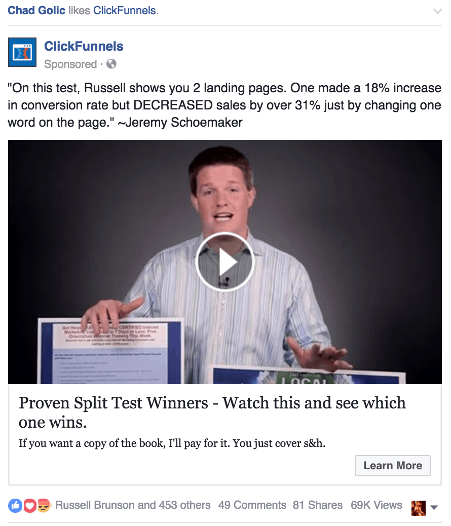
Facebook ad 9
Landing Page - https://dotcomsecretslabs.com/free-book
Doing It Right:
Text - This ad has so many value bombs in it (statistics that scare you, free product and testimonial). The copy is scroll stopping to anyone who has a website and knows that conversion rate and revenue are key success factors for their business.
This ad also scares the browser by stating that 1 word decreased converions by 31%. Stimulating the viewer's thought process "Wait a second, do I also have 1 word costing me 30% of my revenue".
Image - Using video allows them to pack in a lot of information if the user invests the time to watch it.
They have a lot of engagement on this ad which means it is has probably been around a while and is working (Facebook rewards good engagement with lower CPC's and CPM's).
The best type of engagement is the share as it creates a lot of "earned impressions".
Needs Improving:
Text - Not much wrong with this one but the title is probably the weakest link. They could have made it a little more impactful by using the stats in the text or playing into the fear of something costing you 30% of your sales.
For example "Find out how 1 word cost me a 31% decrease in revenue"
Image - Remember to keep your first frame of a video under 20% text, they could have added a title into the holding image to encourage more people to click and watch.
Or they could have also added subtitles for those on mobile with no sound on.
So now you have everything you need to start creating converting Facebook Ads. Make sure you also consider the audience you are targeting when creating your ads. People will respond differently to all these different techniques so always remember to test, test, test.
A few small takeaways to remember:
- Use emotion and storytelling to encourage an engagement
- The image has the largest statistical difference when testing ads, test that first
- Make your ads more relatable by using faces and humans, also avoid stock looking imagery
- Identify a pain point and suggest that you have the solution
- The browser/customer wants to know how you can save them time or money
If you run your own ads for a Facebook or Instagram store definitely check out the FREE offer below as it will drastically help improve your CPA's, CTR's and CPC's.


0 Comments